
By Haris Khattak, student at Haileybury and Imperial Service College
Income inequality has been rising throughout history, but a sharp increase in the 1970s amongst modern economies is seen as the root cause of turmoil in today’s society.
Whilst Britain has seen tremendous growth in the second half of the 20th century, especially after the 2008 financial crisis, we noticed a considerable difference between the winners and losers from income generated through economic growth.
Sir Angus Deaton, a Nobel prize-winning economist who is conducting a five-year research on inequality mentioned; “There’s a sense that London is gobbling up everything and there are cities that are doing OK, but there are large parts of the country where that’s not the case at all.”
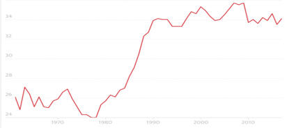
The most popular method used to measure inequality is the Gini coefficient. Named after the great Corrado Gini, an Italian statistician who developed the method in 1912. The Gini coefficient takes a value from 0 to 100 to measure the distribution of a nation’s wealth or income. A value of 0 would represent total equality and a value of 100 would mean that one household controls all the income.
By this metric, inequality increased rapidly in the 1980s, with the Gini coefficient rising from 0.24 in 1979 to 0.34 in 1991. During the 1990s and 2000s inequality fluctuated and rose slowly to reach an all-time high of 0.36 between 2007-2008. Some may argue that inequality isn’t actually rising as it has remained around the same level for the past 15 years. However, inequality still remains at a high level. Furthermore, this isn’t to say that inequality won’t rise again. In the 1960s, the Gini score stood at 0.26 and remained there until the late 1970s, when a sharp increase in inequality occurred.
Although the Gini coefficient is widely used, many economists argue that it can be unreliable as it does not uncover the true extent of inequality. Robert Joyce, a deputy director at the IFS, said: “The Gini is masking different things going on, like the fact that the top 1% is still pulling away from everyone else”.
There are other methods, such as the 90/50 ratio, which looks at the incomes of those in the 90th percentile (the level of income that 90% of the population fall below) compared to those at the 50th percentile (the median level of income). Again, a higher value indicates greater inequality. And the other, the 50/10 method, which looks at the ratio between the median income and the 10th percentile (the level of income that 90% of the population fall above).
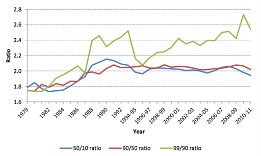
For example, in 1982, a household in the 90th percentile had an income 1.8 times greater than a household in the median and that same household in the median had income 1.8 times greater than a household in the 10th percentile. Over the mid 1980s, the 90/50 and 50/10 ratios both increased, showing an increase in income inequality. However, both levelled off during the early 1990s.
The graph we should really hone our attention at is the 99/90, as Robert Joyce mentioned. This compares the 99th percentile (top 1% of household incomes) to the 90th percentile. Unlike the other graphs, the 99/90 graph continued to rise throughout 1990s and the 2000s from a value of 2.0 in 1988, to 2.6 in 2010. This shows us that the incomes of the richest have grown the fastest over the past 30 years. To put this into context, the average chief executive’s pay in 1998 was 47 times greater than the average worker. In 2017, this rose to a point where the average chief executive’s pay was 145 times greater than that of an average worker.
There are a variety of reasons that can be linked to income inequality rising. Some of these include; changes in government policies, advancements in technology, education and trade liberalisation.
Before the appointment of Margret Thatcher in 1979, the top rate of income tax was 83%. The government changed their tax policy and cut the top rate to just 40%. This cut in taxes directly boosted net incomes of the highest earners. As taxes were significantly lower, this gave an incentive to work for people earning high salaries, which increased the income variation between the highest earners and the rest of the population in the 1980s.
Technological advancements such as the founding of the internet in 1983 by Bob Kahn can be linked to a surge in income inequality. The founding of the internet is believed to be the start of the income inequality crisis by some economists.
American scientist Leon Kass, from the University of Chicago, mentioned; “Technological innovation is important to economic growth and the enhancement of human possibilities.”
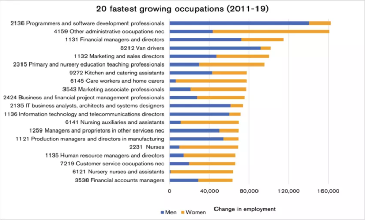
Technological advancements favour those highly skilled workers such as software developers. As we can see from the graph on the right, software developers are the fastest growing occupation in the UK. Wage premiums for those who are highly skilled are bound to increase. In turn, these higher wage premiums result in greater inequality between skilled and unskilled workers.
Another explanation for rising income inequality is trade liberalisation. But first, what is trade liberalisation?
Trade liberalization is the removal or reduction of restrictions or barriers on the free exchange of goods between nations.
When trade liberalisation occurs between developed and developing countries, income inequality can arise in developed countries. This is because workers in developing countries (who tend to require lower incomes) can make the same goods as workers in developed countries (who tend to require higher wages). This leads to goods being imported for a fraction of the price from developing nations. This leads to a reduction in wages for low-skilled workers in developed nations. In turn, widening the income gap.
After reading this article, it is normal to pose the question if inequality is going to keep rising?
In simple terms, yes. Inequality in Britain is bound to increase in the future as it is in any developed English-speaking country. This is likely due to the ‘hollowing out’ of the workforce.
‘Hollowing out’ refers to the weakening of a nation’s or region’s middle class. The result of hollowing out is an increase in working- and lower-class households along with a growing concentration of wealth among the very wealthy.
Hollowing out is a phenomenon that is likely going to haunt Britain for the next few decades. Between 1995 and 2017 the share of mid-level workers has fallen from 52% to 38% and will continue to fall. At the same time, low-level jobs (e.g., crane operators) and high-level jobs (e.g., engineers) have been increasing; widening the ‘gap’ even further.

Contributor to The London Financial
We combine research produced by students and early professionals into a single website, breaking down the barriers to entry individuals face in a number of industries.
Contributor opinions are their own and do not necessarily reflect the stance of the LF.
Very well put!